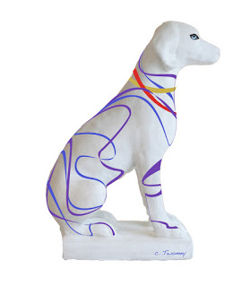
- We have power!!! It's been out since Friday night, making for a very long, hot, basically incommunicado four days. Lots of time spent at Starbucks & Panera. We really got hit by the derecho (straight line) storm, and so did lots of people, trees, homes and power lines. There are still over one million people without electricity, and it's 95 today.
- The best thing I could do with time on my hands was finish the SPCA hound dog for the "Dogs and Cats Around Town" event, so I did! There is Chance the Hound above. On Friday afternoon we're taking him to the Downtown Mall in Charlottesville, where there's going to be a big kick-off for all 18 dog and cat statues at 5:00 pm at the Freedom Wall. Everyone's invited so come on down!
- Hope everyone else is well and staying cool. It's great to be back!
Marketing: Emerging Artist Tips
• Recently I was contacted by a young, fresh out of art school "artist" who specializes in illustration. I put "artist" in quotes because he's currently working at a Starbucks in New York City and trying to succeed on the side. A hard-working, very talented person who just can't seem to break into the field, and finding that the information given in art school just wasn't enough.
• Although it's been many years since I've had to start out attempting to become a successful artist, and though the tools have changed, the basic principles remain the same. I'm still marketing all these years later, so I'm going to occasionally post edited versions of the questions asked, along with my responses.
Q: "My marketing strategy at this time is what I would consider bare-bones, but definitely not unknowledgable. As soon as I graduated from art school, I set to work gathering a long list of potential clients. I started at the magazine rack at Barnes and Nobles, and moved on from there to the internet. I find mastheads wherever I can, I grab the names and addresses for Art Directors, assistant ADs, Creative Directors, and so on, and I add them to the list. I do this whenever and wherever I can. Every three or four months, I then mail postcards with my work to everyone on this list. I feel strongly as if I need more diversity in my marketing strategy. I do not email because I can't be convinced that it's remotely effective or even worth the time that it would take to gather the few email addresses I could find (people seem to protect these better than their mailing addresses). I also believe that it's too easy to automatically get sorted into junk folders, whereas with a physical mailing, at the very least there's a good chance that someone will take a look at what I can do, at least for a few seconds. If I can grab their attention in that time, I win. If not, at least I had that shot."
A: Gathering contact information whenever and wherever you can is a
great start, as is creating and mailing postcards. Your take on emails is correct; they're
often lost, forgettable and viewed as somewhat lazy and intrusive.
• I have known people who've spent a large amount of money on
creating show-stopping, die cut, expensive mailers. I'm not convinced that's a
good investment. If you're already getting some calls from your mailings (and
they're not mega printing dollars to do) then your talent speaks for itself.
• From my experience, the same goes for purchasing (what are often
hugely expensive) ads in the big advertising books like the Black Book. Before
I would do anything like that, I would talk to some illustrator agents, art
directors, other illustrators, etc. to try to judge whether the investment is
worth it. I've spent thousands of dollars on ad books and sometimes gone for a
long time with no results, although some claim consistency of your message
(over the years) is critical.
• The world has changed a great deal, but you need to start doing cold calls. Mailings are not enough; they're too
passive. You need to constantly get to the front of people's minds, and you
can't do that if you don't talk to them and happen to connect with them the
moment they have a need for your work.
• Here's a sample of one of my early marketing pages which was published in a specialized medical art marketing book:
SPCA Auction Statue Progress
Critical things needed to do this kind of work: a very steady hand and a very good brush.
It's a truism that this kind of work often looks much easier to do than it is. After wielding brushes for many years, I can tell you that practice is essential before you start the final work. Judge how easily the brush becomes "loaded" or filled, with paint. Then, glide it across a practice surface similar to the final piece. I actually went outside and got some rocks, which really helped me understand what paint consistency was best, and how fine or thick a line I could easily make.
Spend some time stroking away and realize that no matter how much you practice, when you get to the real, final work you're bound to make some mistakes and you'll relax as you move along. Mistakes? Later I'll show you some custom-made mistake erasure paint. Not that I ever make mistakes. Ever.
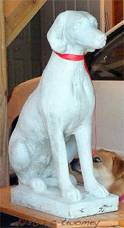
On this particular statue, because I can't move it (150+ pounds?) I became a contortionist. I'm right-handed, which means my most controlled stroke is from left to right. Just imagine how I had to move around the statue - crouching, sitting, bending, leaning - to get the straightest, most beautiful thick and thin strokes. That was about 3.5 hours of painting and yoga!
To get clean, thick and think strokes, I had no caffeine, lots of patience and a pretty expensive Dick Blick Masterstroke Kolinsky Sable #4 brush. The acrylic paint brand is "Folk Art" for projects like this, and was purchased at Michael's. The colors are all liquid and pre-mixed, so I knew exactly what I was going to get.
And the Q-Tips? One of the most essential tools in my magical box. I dip them in water and can easily wipe away errors in the finest details.
Chance will be standing in front of the Happy Cook this summer, so the colors I've chosen reflect some from Happy Cook place settings that were just beautiful. I started out with multiple layers of Krylon Primer followed by Satin White Paint, also by Krylon, also from Michael's.
One note: I plan to spray the entire dog statue with a semi-gloss clear acrylic sealant when it's finished. Until then, I'm careful not to rub up against the colored paints.
Back In The Saddle
The Happy Ms. Kiwi & Me, Cover Girls |
The hospital where I had my total knee replacement at the end of Feb. somehow decided I'd been the "ideal" patient. Clearly, they did not talk to my (Dear Husband) Rick or my PT Jana. So here are the results of a two hour photo shoot and 1/2 hour airbrushed makeup session. And the beautiful girl in the photo with the kind eyes and perked ears? Kiwi, now known as Kiwi-dashian. It IS great to be back.
Note that I ride Ms. Kiwi in the sport of Dressage (United States Dressage Federation/USDF), which Steven Colbert has officially declared "The Sport of the Summer." I am not a rich or fancy person like Ann or Mitt Romney; I'm in the 99%* that love horses and riding, and put horses among the top of my priorities. I try my best to ride in correct biomechanical form, for the good of the horse.
*note the Virginia-clay colored Ariat boots, and though you can't see them, while cleaning them for this shoot, I found two holes in my chaps! Just went and got a new (washable - cool!) pair at Dover Saddlery!
— with Bethany Wood in Earlysville.
A Horse of a Difference Color
The portrait of Wickers is coming along. I'm starting to be satisfied with the masses that have been built up. On the right the labels show where I have concerns and more work to do.
I've grayed some of the areas away from Wicker's face, such as the mane area and lower shoulders and leg. I'm going to add more color into the face to draw more attention.
It's fun to look at the progress:
/catherinetwomeyart/2012/06/wickers-portrait-building-volume.html
Notice also that I've taken the liberty to reduce the size of Wicker's eyelashes. They really are long and beautiful, but cast in the sunlight they made her look like she was sleeping. Artistic license.
Dogs & Cats Around Town Auction
This pup is going to stand in front of The Happy Cook at Barracks road in Charolottesville, VA for three months before the auction. These are the colors found on some of their plates that I just loved.
Input welcomed.
Learning By Comparing
Ok, don't jump to conclusions, I am NOT finished with the Wickers portrait on the left! It is, however, slowly getting there, so I thought I'd take a break and show some anatomical landmarks from an actual equine skull, and where they are showing up on the oil painting.
The skull on the right is not Wicker's skull!! She is still alive and happily sleeping since at this moment, here in Virginia it's pretty warm & humid, so the horses are outside grazing overnight and sleeping in their stalls during the day.
You can see that the skull (right) does not line up perfectly with Wicker's head. For example, Wicker's eye is lower down on her face, whereas her infraorbital foramen is higher. Of course, different ages, sizes and breeds of horses can all influence where features turn up. In addition, there can be anatomic anomalies (see "biology") that get thrown into the mix.
When you're aiming for accuracy and believability, it helps to identify major bony landmarks to make sure you've included them and to also judge whether or not you are seeing and placing them correctly.
SPCA Charity Auction: Dog Name?
- Up for a challenge? I am taking part in a fundraiser for the SPCA. They've asked me to use my artistry to paint this large cement hound to be auctioned off in the fall.
- Until then, after it's finished being painted it will stand in front of the Happy Cook on Rt. 29 in Charlottesville.
- But I need a name!!! By tomorrow!! I was going to name her Lady or Queenie, but she's a boy!!! Being a Board Certified Medical Illustrator, I can recognize these things. Anyway, suggestions welcome, in the name of fun and animal charity!!!
- Oh, and I'm not painting the real, very nosy pup behind the statue; that's Moxey.
- Charity: CASPCA; Charlottesville Area Society for the Prevention of Cruelty to Animals
- Auction: "Dogs and Cats Around Town"
- CASPCA contactc: Cynthia Viejo
Wicker's Portrait: Building Volume
Here's a link to the previous stages of the oil painting. The next steps are above.
These are still relatively thin oil layers. I'm trying to work all over the canvas so I don't get too bogged down in one place. The image on the left is made up of mixed flat colors, whereas on the right they've been blended together. Too much.
Painting is a very strange process, especially if you're in The Zone. Right now I'm in The Zone, but I'm not at all happy with the portrait (right). I do, however, have enough experience to know that if I just keep going and don't panic, there will suddenly be a lightbulb moment and I'll know I'm on to something good.
So as I keep working away, often I step BACK away from the painting or leave the room for a break. The new perspective really helps to see what areas need more work. For example, I wasn't happy with how warm the lower background was (left), and how it was competing with the portrait. On the right you can see it's been cooled down with blues, whites, greens, etc. However, doing that has also made the face appear too cool and too flat. That too will be adjusted.
Every painter has their own approach and habits. One of mine that I constantly fight against is over-smoothing edges. I'm pretty sure that habit comes from years of using an airbrush!
I'm over smoothing/blending now in the right image. I'm about to start getting pretty thick with the consistency of the paint, so I know I can go back and adjust. Since the sunlight on Wicker's face is bright, I can leave some of the edges hard, keep the strong color and still keep the volume.
One final thing: I'm going to have to play around more with color and depth to get the right side of Wicker's face to really stand out from the background. Oh, and I hate the hard edges in the trees at the top. They're next on the agenda!
What's Below the Surface?
- There are three areas needing refinement. The artist will see how their location, size and shape affect the horse's surface anatomy (also see photo below).
- The top illustration is the original, and was introduced here. Circles on the above left illustration show the most important areas needing clarification.
- The top red circle (left), the temporomandibular (TMJ) joint,is the hinge between the horse's jaw and skull. On the right illustration, you can now see where the Coronoid Process of the mandible (lower jaw) passes behind the zygomatic arch, thus completing the joint. Take a look at these two images to see how this joint works.
- The lowest circle, where the upper and lower teeth meet, illustrates the meeting of the upper and lower teeth where the upper and lower teeth have been defined. Compare the hardness/boniness of the area around the mouth to the softer skin of the nose and lower face.
- In the medical illustration on the right above I've labelled other landmark features that can influence the artist's work. We'll get into their importance later; but here you can see important arteries, veins and nerves travelling through these "holes" (foramen) in the skull that can appear on the surface of a painting.
- Some common anatomy terms to help the artist recognize what their function is:
Wickers Gets Oiled: The Final Thinner Layers
These are the final thin layers of oil before I get into the serious thicker paint. I've added more colors and deepened some areas of contrast. I'm not happy with the colors; they're not exactly what I wanted yet and they're too separate from each other. That, however, can be fixed in subsequent layers.
I'm going to need to go in and concentrate more on the area of focus - Wicker's eyes and face. Now, however, I have a decent foundation upon which to build. Note: there is some glare from the flash especially in the neck area, but that will be eliminated as more layers go on.
Never Finished Learning....and Photo Shoots?
I took another hard look at the skeleton/bone illustration I recently posted; the one of the horse's head and neck. It was drawn back in December - February, right before I went into surgery for a new knee. Therein lay the problem! I can see now I rushed and wasn't careful.
Looking closely at the image, I see several anatomical errors, and they drive me crazy! I'll mark them up and post the image again for closer scrutiny. That's the good thing about stepping away from a piece for awhile: everything that you thought looked just fine before takes on a whole new perspective, and in this case, it needs fixin!
The hospital where I had my surgery (Martha Jefferson in Charlottesville) has decided that I was an ideal patient. They clearly did not talk to anyone involved in my recovery.
Tomorrow Martha Jeff is flying in photographers and a make-up artist to do a photo shoot. That's not something I've ever said before. They want to show me riding Miss Kiwi, a lovely mare at the farm next door, to show how well my knee works and how quickly I've been able to recover. Sure didn't seem that way at the time! Ms. Kiwi will be getting some serious bribery carrots.
Anyway, as evidenced by the photo left, clearly I am used to photo shoots with Brad & Angie, which was taken right after my surgery, at the Academy Awards. Gosh, I love Photoshop.
Hoping to post tomorrow, but it's going to be a busy day, what with make-up artists and all....
Contact
email: catherine@catherinetwomey.com
ph: 434-326-5781
cell: 262-893-4126
ph: 434-326-5781
cell: 262-893-4126
Painting What You See and Know
- At this point I want to examine the horse's head and neck anatomy. When I'm painting something I want to be accurate and realistic, it always helps to understand what I'm painting beneath the surface as well as on top.
- I've gotten some real bones (C1 - C3; "C" is cervical) from a great horse buddy to add to the horse skull I already have.
- I want to know what the shapes are that I'm starting to paint on Wicker's portrait and make sure they're in the right size and place.
- Compare the oil painting stage of the Wicker's portrait below to the bony landmarks labelled on the left. Although the view is lateral, whereas Wicker's head is slightly turned, I can still see bony landmarks that are important to show and paint correctly.
- To make certain I'm doing this kind of research accurately,I've referred to many equine anatomy books as well as real bones to do the medical illustration above. What's difficult about it is that the reference books are all over the map! I realize all horses are different, so I'm trying to find an acceptable standard.
- Note the location of the poll (occipital crest and C1; anatomically the occipital crest itself is the "poll") labeled above the C1/ atlas. Wickers the Warmblood is an upper level dressage horse, and I can see that she has been ridden correctly because her poll area is well developed and muscular.
- Incorrect riding ("rollkur") can be seen in the poll of the horse at this link; note that the neck "breaks" further down the neck than it should. This kind of riding can lead to many problems in a horse's anatomy and physiology.
Oil Portrait: Wickers Gets Some Depth
Now that the color background layer is started, the painting is starting to have some atmosphere. In this image, I have begun to add a deeper, sharper layer of Burnt Sienna with a touch of Ivory Black. The large value masses begin to give depth to the portrait, but they have a cookie-cutter effect due to their hard edges. These will be softened where needed. Note how the lighter & whiter areas of the face are beginning to "pop" - becoming more contrasty and prominent.
Compare this to the first wash to see the transition from thin paint to slightly thicker.
The Painter As Visual Leader
Ok, finished with the 2nd background layer. I like the graduated tint from the cooler Cerulean Blue to the warmish Cad Yellow mixed with some Cerulean. I'm not ready yet to commit to anything definite in the background layer, but it will most certainly remain soft and without much detail. The focus will stay on Wickers.
Notice the areas where I went back and softened, such as along the neck top/mane, the ears, and down the shoulder. I used my fingers to blend the background layer into the horse and vice versa. These are areas I wanted to deemphasize, to bring the viewer back to Wicker's face.
My deciding to send the viewer to particular areas is a key difference between an oil painting and a photo. If I were outside in the pasture next door, talking to Wickers like I often do, I would be looking at her face and her entire body. However, being a human, in my focused field of vision I would have the most clarity looking right at one point on Wickers, such as her eyes and mid-face. Sure, I can see everything else, but not with the same level of clarity and detail. I could even paint the rest of her body without directly looking at it. It would, however, be softened value masses without detail, and probably somewhat distorted.
To test this, continue to stare at the screen you're reading now. Then, use your side/peripheral vision to see what's surrounding you. Don't turn your head or move your eyes! Now, imagine having to paint what you see peripherally, the way you see it.
If I were shooting a photo, however, unless I really knew what I was doing with apertures and exposures, most everything in the photo would have the same level of detail, lighting and focus. It's as if there is TOO much information at once. So when using photos as reference, use them with discretion. Think and plan what you're trying to accomplish in the end result so you don't slavishly mimic a camera's point of view. Make it your own!
I want to direct the viewer to what I think is the most interesting, intriguing place, then send them around the rest of the painting from there. When this is done successfully, it's much more like the real-time experience of being outside talking to Wickers & her big beautiful red self -with my eyes flowing from her eyes, face, neck, to her body, the grass, sun, sky, etc.
Wickers and mom Bethany, With Carrots |
Expanding Palette! & Background Wash
Expanding my initial palette, adding Ultramarine Blue, Cerulean Blue, Alizarin Crimson and Viridian Green. Might not use all of them, but like to have them ready in case I decide to.
Generally I start with thinner large puddle washes and add color to them as I move to other hues. This helps the colors relate to each other, as did the overall Burnt Sienna wash as a base layer.
Below, using a large brush to add a thin layer of background color. This is mostly Cerulean Blue, with a touch of Cad Yellow Light.
FYI: I use the M. Graham oil paints. They do not pay me to do their advertising! I've just been very happy with the fact I can use walnut oil to thin the paint and clean my brushes.
Generally I start with thinner large puddle washes and add color to them as I move to other hues. This helps the colors relate to each other, as did the overall Burnt Sienna wash as a base layer.
Below, using a large brush to add a thin layer of background color. This is mostly Cerulean Blue, with a touch of Cad Yellow Light.
Using a Value Comp to Mass Values
That is NOT an alien in the upper left. Just my thumb. It's hard to hold all this stuff and shoot the camera too!
This is a tool called a Value Comp (found at art stores online) that can be used to find the "lightest lights" and the "darkest darks" plus all the grays in between in order to plan the painting. If you follow the green lines from the left squares to the arrowheads, you'll see the grayscale values for various parts of the reference image. This is one method that helps you understand what value belongs where in order to give a subject volume and mass. It also helps to think in terms of areas of blacks, whites and grays, without getting distracted by the all the color and details.
Rarely is there a pure pure white in a subject, for example. The blaze on Miss Wickers is very close to white, but I would paint it using Titanium White and probably a touch of Payne's Gray or Burnt Umber/Burnt Sienna. If anything, I'm going to want to "push back" (decrease the value of and attention to) the white blaze and bring the viewer's focus to a highly contrasting area around her eye. Doing this makes me in charge of how the painting is viewed.
Value Massing: Unfocus Wickers the Warmblood
Up early today, it's going to be 90+ and we're not anywhere near summer yet! Have to get some outdoor things done before it's too darn hot.
What's that fuzzy thing to the left? Your eyesight is failing and you just can't focus? Well, it's just another method you can try to break a painting into large masses of values.
This age-old technique is to squint your eyes at a subject and paint the simplified results. This doesn't work well for me; it's hard to hold my eyes squinty for any length of time and it starts to hurt! And we won't even mention what kinds of squinty wrinkles it causes....
I you happen to be nearsighted/myopic, try taking your glasses off and start painting those simplified masses. If this option is open to you (i.e. you're blinded without your glasses!) it's really nerve racking at first! I had to calm down and accept the shapes and colors as just that - not as an actual something. I use this method often when painting outside/plein air (for once, I'm happy to be nearsighted!) and it's helped my paintings a great deal.
Compare this massing method to the more formal color-coded post.
Massing Values: Twomey's Wickers Portrait
It's at this point of getting ready to seriously build volume that I take a moment to analyze which direction to go. It's too overwhelming for me to just throw paint on the canvas - at least for this kind of piece. I need a plan.
To start, I would take the reference photo of Wickers and bring it into a photo editing program. I use Photoshop. Along the top menu bar is a category named "Filters." Select this, and from the drop down menu choose Gaussian Blur. Up will come a window containing the image, and a handy sliding bar that can be adjusted from barely blurry to very very.
Above is an example of how to mass values to help plan and start a painting. This method may work for you - or not. I'll share several. I'm showing what's really helped me over the last lots of decades! Take a look, for example, at the areas outlined in the light green on the softened image. There are four of them.
The values within these areas combined are all closely related. Their hue, depth, amount of dark and light are very similar.
To make use of this knowledge, I would mix a large amount of this particular color and put it down on the canvas in these areas. Then I would continue on with the next group of related masses. This technique can also be accomplished using a program like Photoshop, using levels or Artistic Filters.
I will eventually go back into the large masses and add subtle nuances of value shifts and details, and soften the cookie-cutter effect left by the application of massed values.
Eventually, the more you practice and understand values, the easier and more automatic it becomes.
Extra help here; a link to Adobe products. And no, I don't work for them let alone get any kickbacks for linking:
http://www.adobe.com/products/photoshopfamily.html?promoid=JOLIW